Golden Cross Pattern: What Does it Mean for Traders?
Key Takeaways:
The Golden Cross pattern signals a transition to a bullish trend, providing entry points for traders worldwide.
Traders interpret it as the start of a strong bull market, especially when accompanied by high trading volumes.
Recognizing this Cross involves observing short-term moving averages surpassing long-term counterparts, indicating potential shifts toward bullish market trends.
Integrating this cross with other indicators and analyses helps traders make informed decisions, enhancing their trading strategies and performance.
Have you ever wondered what the Golden Cross Pattern stands for? What does it mean for traders on a global scale? And, ultimately, how to effectively use it in the long run?
A golden cross in stocks is when a short-term average crosses above a long-term average on a chart.
This bullish breakout pattern emerges when a security’s short-term moving average. One of these is the famous 50-day moving average, crosses above its long-term counterpart, like the famous 200-day moving average or a resistance level within the stock market.
The golden cross signals the start of a strong bull market, as long-term moving averages have a significant impact.
This indication gains additional credibility when accompanied by substantial trading volumes. Let’s learn more about this useful pattern and what a golden cross means in stocks.
What Does a Golden Cross Signify?
A golden cross indicates a sustained bullish market ahead. A golden cross indicates a bullish trend. This happens when a long-term moving average goes above a short-term one. This is the opposite of a death cross.
Understanding the Golden Pattern
The golden cross, a bullish signal in the stock market, is marked by a moving average crossover. This momentum indicator progresses through three key stages:
Downtrend reversal: Buyers prevail over sellers, signalling a shift in sentiment.
Moving average crossover: Short-term average surpasses long-term, confirming the trend reversal.
Sustained uptrend: Moving averages act as support, reinforcing the bullish outlook.
Typically, the 50-day and 200-day moving averages are employed, with longer periods indicating stronger breakout potential.
Day traders often utilize shorter averages like the 5-day and 15-day. Remember, longer time frames tend to produce more reliable golden cross signals.
Are Golden Crosses Trustworthy Indicators?
Golden crosses, as they occur when a short-term moving average crosses above a long-term one, seem dependable since they manifest after a market upswing.
However, this lag makes it easier to identify false signals afterwards. Traders commonly use these crosses to affirm trends or signals, particularly with other indicators.
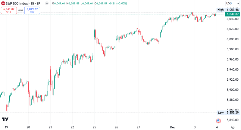
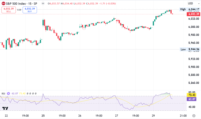
For instance, observing a this cross on the S&P 500 index can reinforce market sentiment and trend analysis.
Some experts say a golden cross happens when the 50-day moving average exceeds the 100-day moving average. Others say it’s when the 50-day moving average crosses the 200-day moving average.
What is the best example of the Golden Cross Pattern?
The chart initially shows a decline in the 50-day moving average until it hits a level the market can’t sustain, while the 200-day moving average stabilizes after a slight drop.
As prices gradually rise, the 50-day average starts climbing, too, eventually surpassing the longer-term average. This crossover forms a golden cross, indicating a shift from a downtrend to an uptrend.
During this change, a big jump in the candlestick price range suggests a shift in market sentiment.
When the uptrend starts, candle bodies are big. More days close higher than opening prices. This happens after the 50-day moving average reaches its lowest point.
How to Recognize a Golden Cross on a Stock Market Chart?
A golden cross in the stock market unfolds when a short-term moving average overtakes a significant long-term moving average, heralding a shift in the long-term trend.
Analysts and traders interpret This event as a buy signal, indicating a favourable price action ahead.
Some specialists delineate it as when the 50-day moving average surpasses the 100-day moving average, whereas others identify it as where the 50-day moving average meets the 200-day moving average.
The shorter-term average exhibits accelerated upward momentum compared to the longer-term one until they intersect, reflecting the potential for sustained bullish price action.
Exploring the Contrast Between a Golden Cross and a Death Cross
The golden cross occurs once the 50-day SMA surpasses the 200-day SMA, signalling a bullish sentiment and potential entry opportunities in the market.
Traders and investors frequently perceive the golden cross as indicating the shorter-term price trend shifting towards positivity.
A golden cross and a death cross serve as opposing signals in the market. The golden one suggests a transition to a bullish market, indicating a potential long-term uptrend.
Conversely, a death cross warns of a bear market, signalling a possible long-term downtrend. Both crossovers gain significance when accompanied by high trading volume.
Golden Cross
Marks the emergence of a potential bullish market.
It occurs once the short-term average crosses above the long-term average.
The long-term average then acts as a supportive level.
Death Cross
The death cross occurs once the shorter-term average declines and intersects the longer-term average, moving in the opposite direction of the golden cross. It also:
Suggests the onset of a bear market.
Arises when the short-term average descends beneath the long-term average.
The long-term average becomes a resistance level.
Following the crossover, the long-term average serves as a crucial support level for a golden cross or resistance level for a death cross.
While these crosses can signal a trend change, they typically manifest after the change has already occurred.
Pros and Cons
Now let’s look at its main pros and cons, shall we?
Pros
The Golden Cross offers valuable insights for portfolio managers, aiding in assessing investment health and market trends.
By integrating it into portfolio analysis, managers can adjust allocations accordingly, leveraging potential shifts toward bullish market trends. This strategic approach enhances portfolio performance.
Identifying Potential Entry and Exit Points
The Golden Cross is a pivotal tool for pinpointing entry and exit points in the market. It alerts a shift in market sentiment towards bullishness, indicating upward price momentum.
Traders use this frequently to time entry into long positions and exit existing short ones, optimizing trading strategies and increasing trade profitability.
What are its drawbacks?
On the other hand, one of the main drawbacks of the Golden Cross is:
False Signals and Whipsaws
One limitation of the Golden Cross is the risk of false signals and whipsaws. To mitigate this, traders often use additional indicators or multiple moving averages.
Dependence on Historical Data
The Golden Cross relies on historical price data and may not capture sudden market shifts. Traders should consider other indicators and current conditions.
Consideration of Other Factors
This cross should be combined with other analyses, like the fundamental analysis and market sentiment, for well-rounded decisions. Relying solely on it may overlook critical market dynamics.
Bottom line
In conclusion, the Golden Cross pattern has significant implications for global traders. It signifies a transition to a bullish trend, providing potential entry points and guiding portfolio adjustments.
However, it’s essential to recognize its limitations, such as the possibility of false signals and dependence on historical data.
By integrating the this cross with other indicators and analyses, traders gain a strategic advantage.
With this useful approach, traders get all the essential tools to make more informed decisions, navigate market dynamics effectively, and take control of their trading strategies and performance.
The post Golden Cross Pattern: What Does it Mean for Traders? appeared first on FinanceBrokerage.


